
Tweet Wars: The Last Data Point

It has been two years since we have started Knoyd. We have helped quite a few companies using their data more efficiently and have learnt a lot during the process. It has also been two years since we published one of our very first blog posts, analysing tweets about Star Wars: The Force Awakens. And since the new installment has hit theaters in December, we have decided to create a re-hash of this original blogpost.
We have (once again) tracked the activity on Twitter before and after the release date to gain insight into the reactions of people and their feelings about the latest episode of the most famous movie franchise in history. We will also comment on the changes in the original code we created.
DATA:
We have collected the stream of Twitter data containing search terms and hashtags related to Star Wars: The Last Jedi through the TwitterAPI. The data had been collected between 24th of November 2017 and 8th of January 2018 (with world premiere being held on Dec 15th). All together more than 40 million tweets were collected, with ~7% containing geolocation either in form of direct coordinates or human readable location (e.g. New York) and ~20% being in english. One change we have improved over the years was the deployment of the collection script. Using micro instance on AWS and a cronjob to periodically sync the data back to our local machine, we managed to make the script error proof, while the whole thing remained free thanks to Amazon's Free Tier program.
Since we have collected almost 4x the data than in the previous experiment, this came with its own set of challenges. The python library for detecting tweet language that we used before (langdetect) was just too slow to process this much data and so we used (langid) instead that gave us a ~100x speed improvement.
TRAFFIC:
The first thing we looked at was the frequency of Star Wars related tweets in time. It is clearly visible that most of the tweets came from US and UK, which can be easily explained by popularity of Twitter itself in these countries. The next thing to see is the periodicity of day and night, where people tweet more at night than during the day. Also the timezone shift is clearly visible.
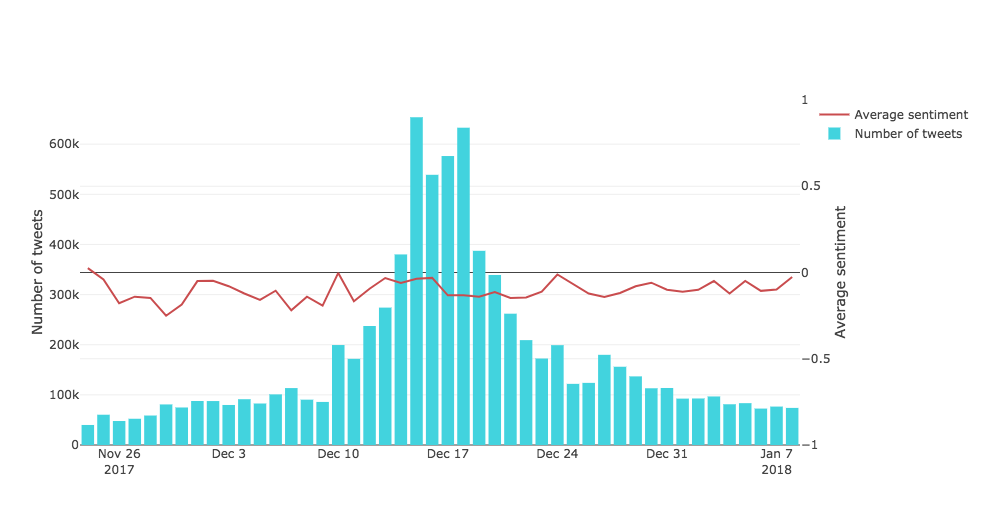
More interestingly, we can see the build up before the release, as the number of tweets is increasing for a few days before the world premiere and sky rocketing on this day.
Just like two years ago, we have used a service called Carto (previously CartoDB) to create this cool map. The guys from Carto came a long way in the two years and their product unfortunately doesn't have a free version anymore, but it is definitely worth checking out.
SENTIMENT ANALYSIS:
One thing is to see that people tweet, but what do they think? To look at this problem we used a sentiment analysis model, which assigned each tweet a score between -1 and 1 (-1 being a total hater, 1 someone willing to die for the movie). First we plotted the results in a hexbin map, visualizing the sentiment in the world split in little hexagons (aggregating by mean within the cell).
There are clearly visible small areas of very strong and positive opinions in Canada and northern and eastern Europe, which was consistent with our previous findings. There is a new fanbase based out of Morocco. Also apparently people did not like Star Wars (on average) very much in South America, Turkey, Japan and Indonesia (just like 2 years ago).
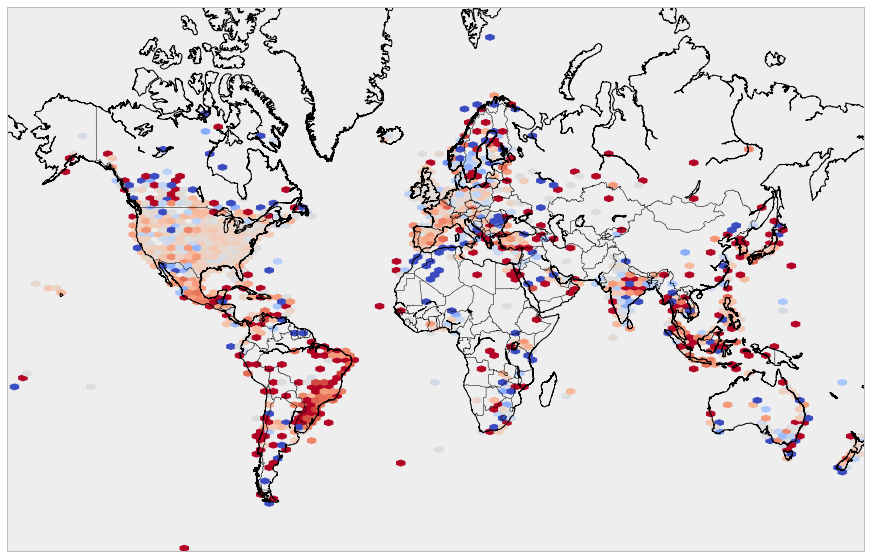
Hexbin map of Twitter sentiments: using coolwarm reverse pallet (dark red = -1, dark blue = 1)
We have still limited the analysis to the tweets in English language. NLP came a long way in the last two years and with a bit of additional effort and use of deep learning based techniques, it wouldn't be too much trouble to extend this analysis to account for multiple languages.
Let's take a look at how the sentiment evolved with number of tweets over the course of time. The number of tweets follows the normal distribution pretty closely with median around the release date. The average sentiment hovers around the same levels throughout the experiment.
Conclusion
It was a fun exercise to revisit the code we have written over 2 years ago. Even tough the analysis remains largely the same, there are a few points that are good to mention:
Document your code. You will thank yourself in a couple of years
The open source tools evolve quickly. Don't take the way you solved a problem as a given
Automate as much of your process as possible