
Time-series Analysis - Part 1

In this two part blog post, we will show you how to analyse time-series and how to forecast future values by Box-Jenkins methodology. As a testing dataset, we have chosen the "Monthly production of Gas in Australia". This dataset is available from datamarket for free. We have restricted data from the time span 1970 to 1995.
We are splitting the topic like this:
PART 1 - Explanatory Data Analysis
PART 2 - Forecasting by Box-Jenkins Methodology
1. Explanatory data analysis
In the first installment, we will begin with explanatory data analysis. This part is useful for everyone who wants to visualise time-series. First we have to load our time-series into pandas data frame and create two series. First is our test series (20 years) on which we train our model and the second one is the series for the evaluating model (5 years).
df = pd.read_csv('gas_in_aus.csv',
                  header = 0,
                  index_col = 0,
                  parse_dates = True,
                  sep = ','
                  names = ["Gas"])
y = df['Gas']
y_train = y["1970" : "1990"]
y_test = y["1991" :]
After successfully loading our data, it is reasonable to plot the y_train series to get to know what our data looks like:
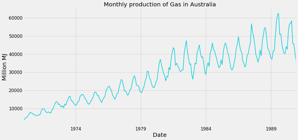
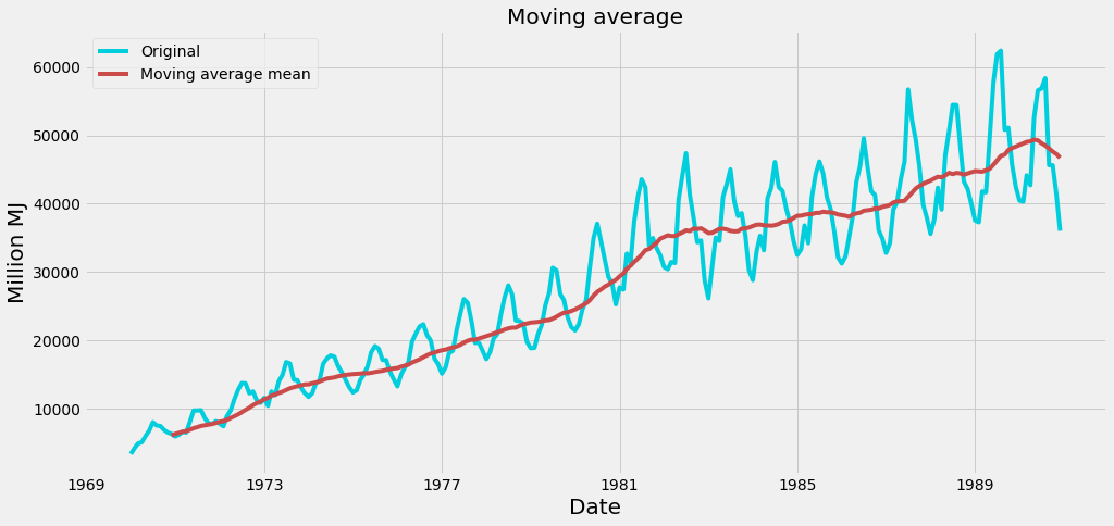
From the plot above we can clearly see that time-series has strong seasonal and trend components. To estimate the trend component we can use a function from the pandas library called rolling_mean and plot the results. If we want to make the plot more fancy and reusable for another time-series it is a good idea to make a function. We can call this function plot_moving_average.
def plot_moving_average(y, window=12):

    # calculate moving averages
    moving_mean = pd.rolling_mean(y, window = window)

    # plot statistics
    plt.plot(y, label='Original', color = '#00cedd')
    plt.plot(moving_mean, color = '#cb4b4b',
             label = 'Moving average mean')
    plt.legend(loc = 'best')
    plt.title('Moving average')
    plt.xlabel("Date", fontsize = 20)
    plt.ylabel("Million MJ", fontsize = 20)
    plt.show(block = False)
    return
To use this function we have to check our time-series and try to estimate the length of its period. In our case, it is 12 months. If it is not possible to make a decision about the length of the period from the plot you have to you use a discrete Fourier transformation and a periodogram to find periodic components. However, this would go off topic within this blog. After applying our function to time-series we get a plot with an estimation of the trend:
Let's say we want to know in which months the production is the biggest. It is not clear from the original time-series. Because of that, we will look at our data from another point. We want to see our time-series as a plot which shows month on the x-axis and production on the y-axis. Each line in this plot represents one year:
df_train['Month'] = df_train.index.strftime('%b')
df_train['Year'] = df_train.index.year
month_names = pd.date_range(start = '1975-01-01', periods = 12, freq = 'MS').strftime('%b')
df_piv_line = df_train.pivot(index = 'Month',
                             columns = 'Year',
                             values = 'Gas')
df_piv_line = df_piv_line.reindex(index = month_names)

df_piv_line.plot(colormap = 'jet')
plt.title('Seasonal Effect per Month', fontsize = 24)
plt.ylabel('Million MJ')
plt.legend(loc='best',
           bbox_to_anchor=(1.0, 0.5))
plt.show()
By running the code above we get:
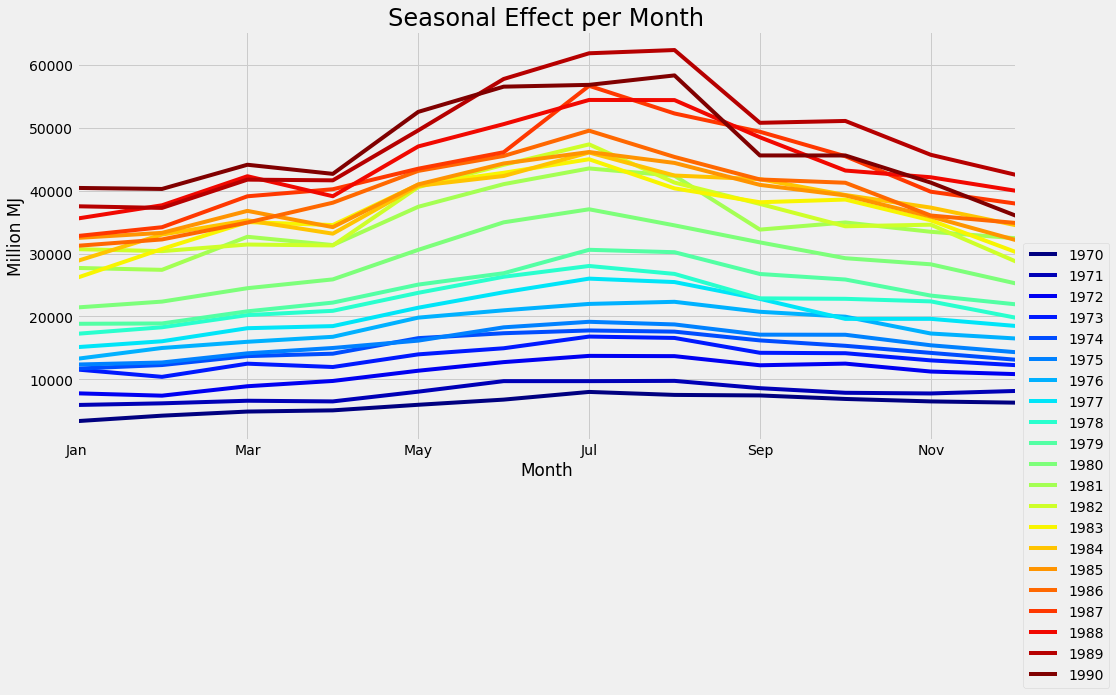
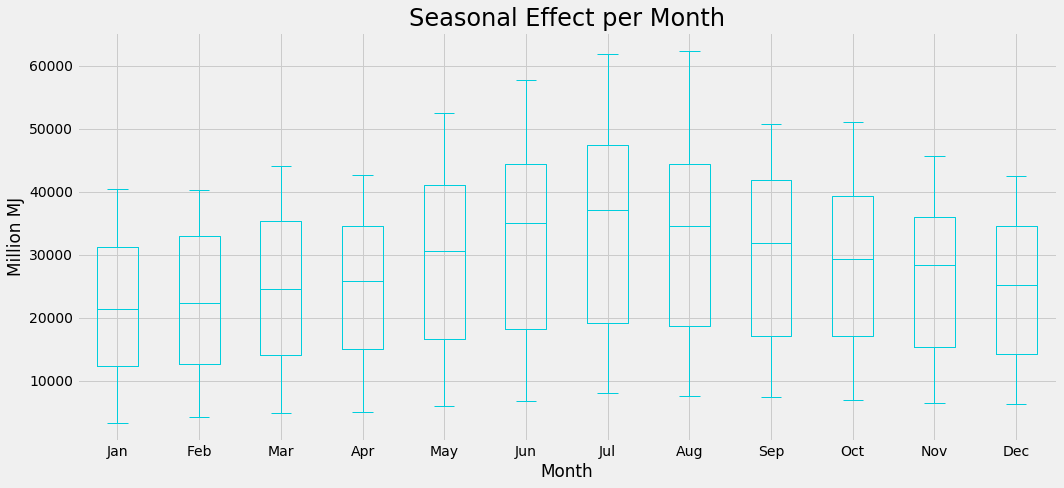
From this plot, it is clear that the biggest production is in winter (as expected). It is also easy to compare years with each other and see how every year increases the production of gas. Another way to look at the same data is to use box-plots:
Conclusion - PART 1
As you can see from the plots of this blog, time-series visualisations do not have to be just one plot with dates on the x-axis and values on the y-axis. There are many other ways to visualise time-series and get interesting hidden features from them. If you are interested in getting as much as possible from your time-series data, do not hesitate to contact us.
Stay tune: In the next part, we will look into forecasting future values from time-series by Box-Jenkins methodology.